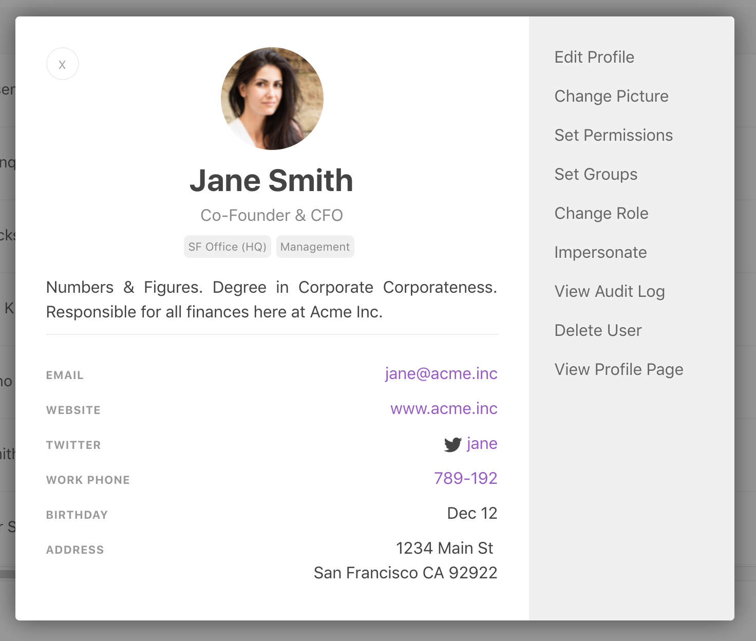
We’ve been busy redesigning many screens and dialogs over the past few months. Some of these changes will be launched later and we look forward to sharing all updates soon. A few of these updates we’ve already launched, like a design refresh of user profiles.
On a Papyrs site, each user has a profile card which people can use to look up more information about a team member (such as their status, position, expertise, and so on). With the new design, clicking on a user anywhere in the interface will bring up a new profile card, making it easier to quickly look up the details of the author of a page, or someone in the People directory, for example. Administrators can also access all user-related options from this profile card.

