Category Archives: General

Papyrs Updates & Improvements – November 2014

Another quick update with some new features and improvements we’ve been adding to Papyrs recently:

Navigation Widget — Show recent pages

The navigation widget allows you to add dynamic navigation to other pages, categories and users on your pages. One of the options is to show all pages in a certain category or with a given tag. Another option is to only show recent pages; the 10 most recently updated pages, for example. Some of you were looking for the combination of those two: showing the newest pages within a certain category or tag. This is very useful if you’re creating news or blog post pages, for example, storing them all in a category like “News”, and then want to show a list of the latest news pages on the homepage. With this new update that’s now possible, and you can find the new option in the page navigation dialog:
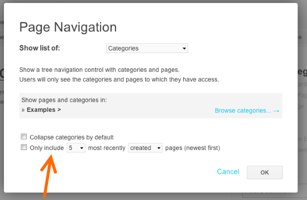
page-navigation-newest-only

Paste tables

Although this one is not very visible, it will hopefully save you some time when you need to copy data from another table to your Papyrs page. When you’ve copied table data to your clipboard, insert a table widget on your Papyrs page, and then paste (Ctrl/Cmd+V). For example, copying a table on world languages from Wikipedia:
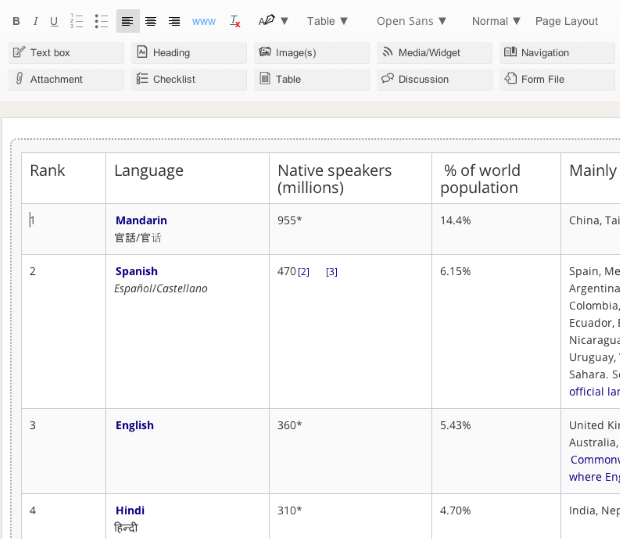
table-languages3

Improved uploading files from Google Drive

If you’re using Papyrs for Google Apps, you might have noticed we improved the file picker when attaching files from your domain’s Google Drive to Papyrs.

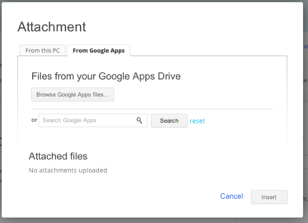
When you add an Attachment to the page, select from Google Apps…
google-apps-attachment

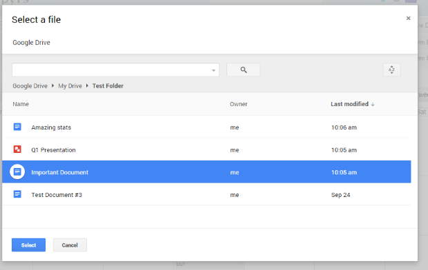
Like before, you can now search for files to add to your page. The new option is to browse your files using Google Drive’s new file picker. Click “Browse Google Apps files…” and you can browse and select the file (or multiple files, using Ctrl+click). You can also navigate Drive folders in the new file browser, making it easier to find the file you’re looking for.

google-apps-attachment-picker

Notifications on updated form entries

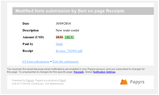
If you subscribed to notifications for a form page, Papyrs sends out a notification when a new form is submitted. With this new update, Papyrs also sends out a notification when a form entry (which you can access) is updated. For example, when someone corrects a form entry, you’ll get a notification like this:
updated-form-notification

More

We’ve also been working on many other improvements behind the scenes, like performance updates for larger pages. We hope you’ll like these updates and we’ll have some more visible updates to share with you again soon!

Thanks for using Papyrs!

How CentricDigital is using Papyrs to boost productivity

We recently talked with CentricDigital about their fast growth, their challenges, and how Papyrs helps them improve productivity.

Company

Centric Digital is a digital transformation company that reshapes business models and customer experiences to help traditional businesses grow in an increasingly digital society. Recently ranked #34 on the Inc 500 and named fastest growing company in New York City by Inc. Magazine, Centric Digital fuses management consulting rigor, digital acumen and startup creativity to raise the bar in digital solutions and services. Headquartered in New York, Centric Digital has 160+ team members in the US and worldwide including Argentina, Australia, Hungary and India.

Challenge

It was hard to communicate across teams and to host internal documents and announcements. Because of Centric Digital’s tiered structure of employees, freelancers and contractor roles, they needed a system to deliver customized messages and information to select individuals. With new contractors or employees joining the company regularly, it’s important to manage access to the information easily.

“We needed a one stop solution for all company wide information/policy/procedures/processes that could also be accessed by new employees, rather than depending on emails that would vanish after being sent,” says Brian Manning, President & Chief Digital Officer at Centric Digital. In order to meet this challenge, Centric Digital started looking for a cloud based solution.

Papyrs

“Papyrs is used as our all encompassing intranet, replacing the needs for employee manuals, process documentation, on-boarding processes, company information, etc.”, says Manning. “Customizing and building our own forms and documents allows for consistent branding across all internal communications.”

Read the full case study here (PDF)

(Also interested in sharing your story in a case study? Let us know!.)

Papyrs & Google Apps update

Just a quick update for Google Apps users on the integration of Papyrs with Google Apps (if you’re not using Google Apps, you can skip this post..). Google recently updated their Google Apps Marketplace, so all apps – including Papyrs – needed to be migrated to the new Marketplace. If you signed up for Papyrs for Google Apps recently, you most likely already found us through the new Marketplace. Last week we migrated all older accounts to the new Marketplace.

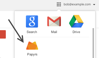
The changes are mostly under the hood and in the software Google is using internally, so you shouldn’t notice any real difference. One minor change you might have noticed is that Papyrs now has its own icon in Google’s navigation menu:


(you might have to click on More in the menu to see it).

Another minor change is that by taking advantage of some new Marketplace options, Papyrs for Google Apps now needs fewer permissions from your Google Apps domain.

Just like before, Papyrs for Google Apps allows you to add Google Calendars and Drive documents to your pages, and offers integrated search and Single Sign On with your domain users.

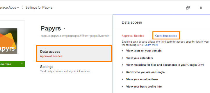
We tried to make sure as much of the migration was completely automatic. If you have any problems accessing your Google Calendars/Documents/Users from Papyrs, however, your Google Apps domain administrator might have to re-approve the permissions needed by Papyrs in the domain’s Admin panel. It just takes two simple steps:

  1. Go to admin.google.com > Marketplace Apps > Papyrs > Data Access.
  2. If you see Approval Needed, click the Grant data access:

That’s all!

Papyrs among top installs!

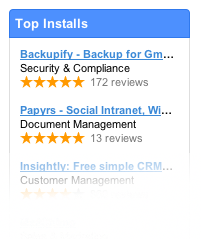
We’re also very proud to be among the top installs of the Marketplace, making Papyrs for Google Apps the highest rated Google Apps intranet solution. Thanks everyone!

top-installs
papyrs-marketplace-tile

New features: Table Widget, Indented Lists

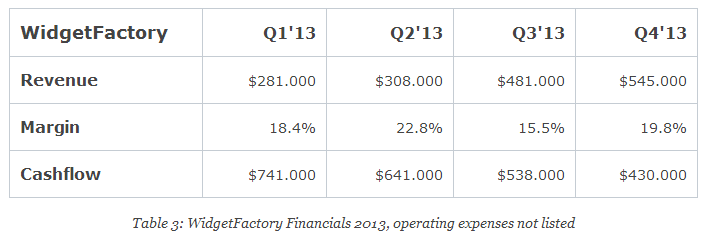
We recently added two new features to Papyrs. A Table widget and support for bulleted/numbered lists. Below we’ll go through the features in detail:

Table Widget

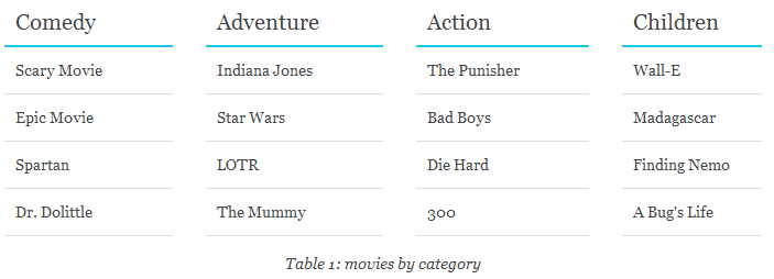
table1

table3

table3

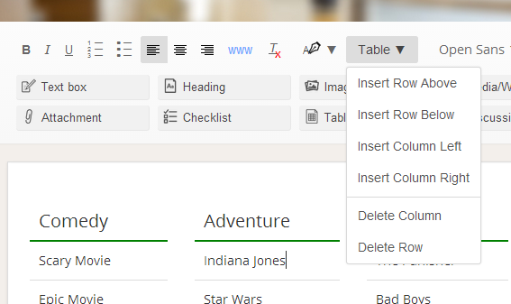
After dragging a table widget onto the page you’ll see a menu (pictured above) with the following options:

  • Insert a row above the table cell with focus,
  • Insert a row below the table cell with focus (ctrl+enter),
  • Insert a column to the left of the table cell with focus,
  • Insert a column to the right of table cell with focus (ctrl+shift+enter),
  • Delete the current column,
  • Delete the current row (alternatively: by selecting the row(s) and pressing delete)

You can use all rich text functionality inside a table. So you can change text alignment, font sizes or colors or you can created bulleted (or numbered) lists inside a table:

table2

Indented Lists

list

Pretty much what you can see on the picture above. You can add lists and lists within lists. Numbered lists and bulleted lists are both supported by Papyrs. You can indent lists by selecting the list item and pressing the Tab key. Use shift+tab to de-indent the list items. On modern browsers you can indent en de-indent multiple list items at the same time. Just select multiple lines and hit tab.

Coming soon!

We’re working on the finishing touches of a major update to Papyrs. So watch this space!

New People Directory and other updates

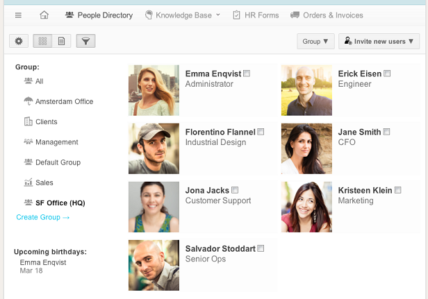
Today we’re announcing a new updated design for the People Directory and all related user setting screens.

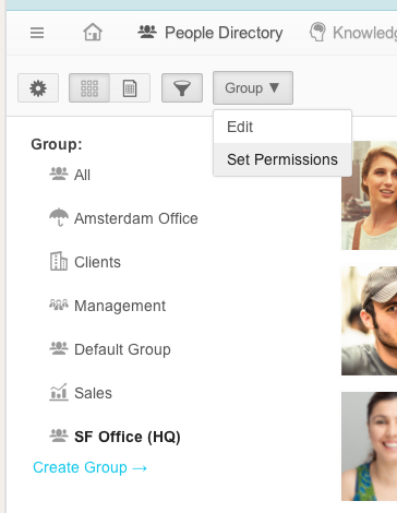
The new design makes it easier to browse through all the people in your organization and quickly look up their details. Administrators can also invite and change settings for people directly from the new People Directory. Groups have also been updated and are now displayed more prominently with an optional icon.

New People Directory

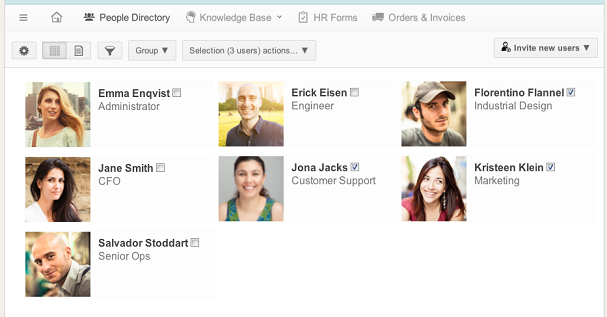
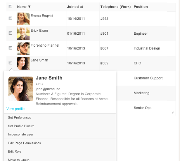
The default view for the People Directory can also be customized, allowing you to view the directory with large icons, or in a table, with just the columns you like (from phone numbers to birthdays).

Clicking on a user instantly shows profile details and relevant settings for Administrators:

The permission settings screen has also been updated, which allows Administrators to quickly change permissions for everyone in a group:

group-edit

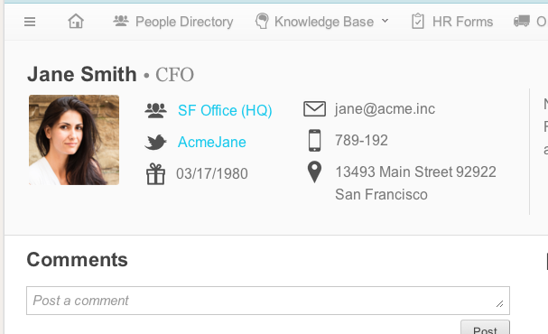
The following screenshot shows the new design for people profiles:

screenshot-profile-page-small

The Navigation widget has also been updated to include options for listing users and groups, making it easier to directly link to profiles for people responsible for a project or page, for example:

We also made a bunch of other small changes, from speed improvements to simplifying settings.

We hope you like these new updates. Over the coming months we’re we planning to release more design updates and customization options, so stay stuned!